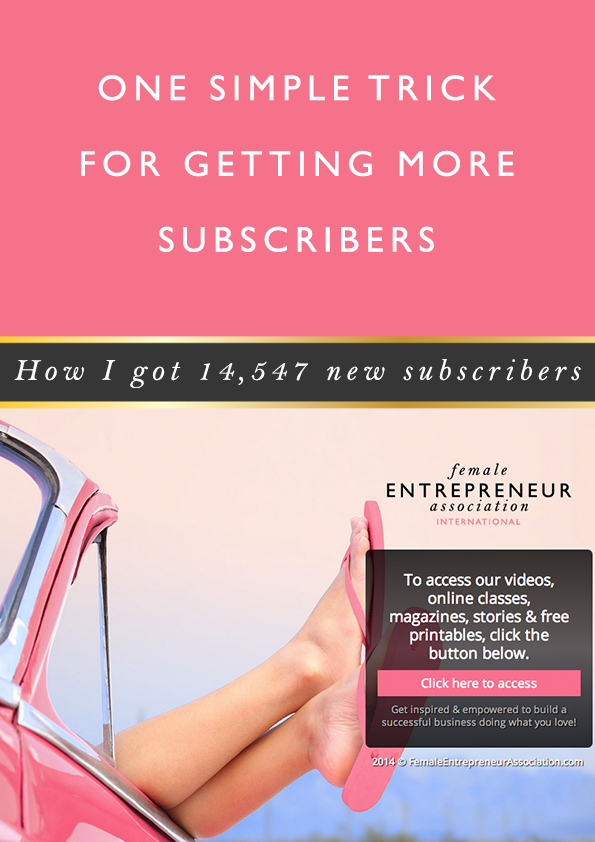
I love to test new things that can help me to grow the FEA and make things more effective, and so earlier on this year I decided to test out something I’d seen other people do and that is…
Creating a welcome gate.
To this day, this simple idea has generated over 14,547 new email subscribers for me in just a few months, so I want to show you exactly how I did it…
First off, let me explain what a welcome gate is. A welcome gate is a page people are redirected to when they go directly to your home page and then you show them a page where they can opt-in.
For example, when you got to mixergy.com you’ll be redirected to mixergy.com/goto/welcome where you’ll see the following page:
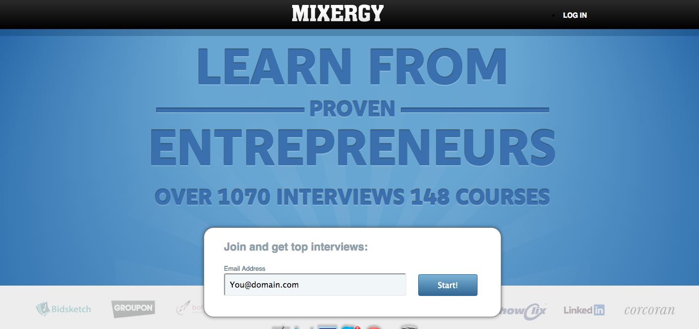
Mixergy make it seem like you have to opt-in to access their content.
When I saw Mixergy were doing this I thought to myself “it must work, otherwise they wouldn’t be doing”. So I decided to try it out.
Tip: watch closely to what successful businesses are doing & test out what they’re doing yourself. It’s one of the ways I learn new things to try.
To be honest, I really didn’t think it would work and I was a little worried it would annoy people, which is not something I ever want to do. But, I figured I’d just test it out for a couple of weeks and see what happened.
So I set it all up (which I’ll tell you about in a minute) and then I waited. When I went back later on to see how it was getting on I was really surprised to see that I had some subscribers! So I kept it up for longer…
And have never taken it down.
I still have the welcome gate and to this day it’s generated over 14,547 new email subscribers.
So, this is definitely a strategy worth testing!
If you want to test this strategy out for yourself, here’s how I did it…


MY AIM
Before I did anything, I figured out the best way to make the most of the welcome gate.
I decided what I didn’t want it to be and what I did want it to be.
I didn’t want it to be a welcome gate where I offered a specific freebie. Instead I wanted to use the gate as an opportunity to tell people what they could expect from the FEA – what they could get access to on our website.
I began to realise that I could use the welcome gate to educate people on what FEA is all about, how it can help them and how they can take advantage of everything we have ever created.
So first of all, decide what the aim of your welcome gate will be.

CREATING THE WELCOME GATE
So once I knew that I wanted to use the gate to tell people what to expect, the next thing I had to do was create it.
For this I used LeadPages. I personally LOVE LeadPages. It has made my life so much easier when it comes to creating opt-in pages.
The reasons I chose LeadPages are:
1) I didn’t want to spend a fortune getting someone to design & build an opt-in page for me, that I wasn’t even sure would work!
2) I wanted to be able to track the conversions easily – with LeadPages I can do this.
3) I wanted to be able to split test the opt-in page, so I could optimise the performance of the page. LeadPages makes this so easy (although, I have to admit, with my welcome gate I’ve never got around to split testing. I just set it up and left it to do its thing!)
I chose a simple design for my welcome page…

As you can see it’s made up of:
1) A cute image, which is random, but seems to catch the eye of my audience. If you’re going to use an image, make sure it will resonate with your audience and make sure it’s good quality. I get most of my images from BigStockPhoto.com.
2) My logo – so people know what they’re accessing
3) A headline/ description about what they will access by signing up – I love the fact that I get to tell people in one sentence the main things they can access on the site. There’s a lot going on on our homepage and website in general, so the fact I get to tell them in once sentence is great, because so often people don’t realise all the cool stuff we create (this is a problem a lot of people have!).
4) A button that tells them to click to access.
5) A short sentence summing up the mission of FEA, so people know what they can expect to get from the videos, classes etc.
You don’t have to do what I’ve done, but if there’s one piece of advice I can give it’s this: keep it simple. You have a few seconds to catch people’s attention and get them to do something, so really think carefully about what you’re creating. Once you’ve created it get feedback from business friends and see what they think.
If you do use LeadPages, once you’ve set up your page and hit publish, the way you turn it into a welcome gate is by selecting it when you add the page to your website. See the screenshot below:
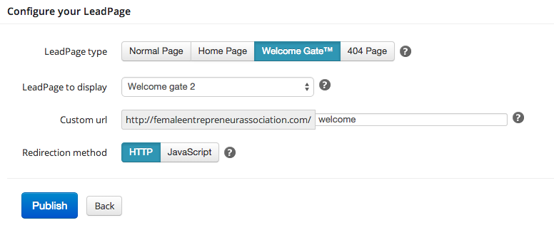
NOTE: people will only see your welcome gate if they go directly to your home page (so if you send people to a specific article, they won’t see it, because that would be kind of annoying!) and they will only ever see it once, so it won’t keep annoying people :)

WHAT HAPPENS AFTER SOMEONE SUBSCRIBES
One of the most important things you have to do is think about what happens once someone opts-in.
For me I realised that this welcome gate was an amazing opportunity to create a great experience for people who were signing up.
So I decided to take people who signed up to a “getting started” page, where I could welcome them on board and make them feel part of something (which is important, seeing as FEA is a community!), I could help to make them feel like they were part of something that was going to help them, by addressing their potential challenges and resonating with them, I could tell them what great stuff was going on at FEA that they could get involved with – free things they could take advantage of and paid things, like the Members’ Club.
My mission was to take them to a landing page that was going to wow them. A page that made them feel like FEA is 100% for them. I wanted to delight them.
So think about how you’re going to delight and wow people once they’ve opted-in to your welcome gate.
Here’s my page if you want to check it out >>
TIP: Go above & beyond to delight your audience.

TEST IT
Once you go live with it, keep a close eye on how it’s performing. You want to make sure the conversion rate of people landing on that page and then signing up is decently high.
At the moment my conversion rate is 38%. It was much higher at the beginning and I’m definitely going to be testing out some new page ideas, but I’m happy with the performance over all.
If you’re worried that you’ll lose people or put people off the truth is you might.
But the way I see it, you’re probably just losing people who aren’t really in your target audience or who wouldn’t be your dream client and that’s ok.
What we do isn’t going to please everyone, and it shouldn’t. You don’t want to have people subscribe to your list who don’t love what you do, because they’ll get sick of receiving emails from you and you’ll be wasting your time trying to build a relationship with them.
![]()
So there you have it, that’s how I got 14,547 subscribers from one page on my site in just a few months.
I do think this is something worth testing, even if you don’t get much traffic, and I’m guessing that as you’re still reading this rather long post, that you’re interested in giving it a go.
So DO IT. Test it out and come back and share your results with us :)
I hope you’ve found this helpful, as always I love reading your comments, so if you want to leave one it will make me smile.
Also, keep a look out, because I’m going to be sharing another tool I use that helped me to start generating way more subscribers and it took me literally minutes to install! You need to test this out – so keep a look out for the post :)
Carrie xx
P.s. I mentioned LeadPages in this article and if you click through on the link and sign up I will earn an affiliate commission. I just wanted to let you know :) I only promote products I use and believe in. If you’d rather not use my affiliate link, just got to LeadPages.net.


